Sunday, April 24, 2011

Star Plots


This is an example of a star plot. There are many examples of star plots on this picture.

Correlation Matrix


This is a photo of a correlation matrix. This is a way to understand how certain categories can be compared.

Similarity Matrix


This is a view of a similarity matrix. The different colors depict different amounts from the category. 

Stem and Leaf Plot


This is a classic example of a stem and leaf plot. This is an easy system of seeing information.

Box Plot


This is a box plot graph. In box plot graphs it helps to compare different amounts with showing where the median is. 

Histogram


This is a picture of a paraview Histogram. This is comparing different categories with colors and data. 

Parallel Coordinate Graph


The parallel coordinate graph can compare many different attributes. These types of graphs are great for visualizing how different categories compare.

Triangular Plot


This is a triangular plot of three different chemicals. Triangular plots are good for comparing three different sources.

Windrose


This is a windrose that are on most maps. A lot of times they use these with a compas to know which way north is. 

Climograph


This is a climograph on Australia. The things they are comparing are temperature and precipitation.

Population Profile


This is a population profile of Immigrants in the United States in 2004. This compares how old they are to their sex.

Scatterplot


This is a scatterplot graph. This is a graph between husband and wife's age. 

Index Value Plot


This is an index value plot graph. This shows the index of the contractions and expansions of the company.

Accumulative Line Graph


This is an accumulative line graph. There are many different types of data in the graph that they are comparing.

Bilateral Graph


This is a bilateral graph of amount of hearing correct. This goes over two different variables.

Nominal Area Choropleth


This is a Nominal Area Choropleth map of Florida. This shows the different types of soil in Florida.

Univariate Choropleth Map


This is an unstandardized choropleth map of the United States. This shows what denomination is more popular.

Bivariate Choropleth Map


This is a Bivariate Choropleth map of Warsaw. This displays how much of the population is rural. 

Unclassed Choropleth Map


This is an unclassed Choropleth Map of France. This is probably the first unclassed one. 

Classed Choropleth Map


This is a classed choropleth map of Great Britain. This shows the spending of residents.

Range Graded Proportional Circle Map


This is a Range Graded Proportional Circle map of the southern states. In this map you can see how much of a filipino population there are depending on the state.

Continuously Variable Proportional Circle Map

https://www.e-education.psu.edu/geog486/l5_p5.html

This is an early Continuously Variable Proportional Circle Map. This certain map was one of the earliest ones of France in 1850.

DOQQ


This is an aerial photo of a DOQQ. This photo can be used to see what certain areas look like. 

DLG


This is a Digital Elevation model of the United States. The reader will see that the Rockies are elevated much higher.

DRG


This is a digital raster graphic of the United States geological survey. These maps are scanned from the Geological Survey.

Isopleths


This is an isopleth map of England. This shows water quantity through the island.

Isopach


This is a map displaying different amounts of ash from a volcano in Nicaragua. The cartographer used isopachs to demonstrate this. 

Isoheyts


This is a map using Isoheyts in a map of Gujarat. Isoheyts are used to connect areas that have the same amount of rainfall in areas.

Isotachs

http://www.erh.noaa.gov/btv/events/28Oct2008/ua2.php

This is a map displaying isotachs on the united states. These Isotachs are helping to display winds at different strengths.

Isobars

http://www.weatheronline.co.uk/reports/wxfacts/Isobars-on-surface-maps.htm


This is a picture of isobars on a map in Europe. The different zones are high and low pressure systems moving through the areas.

LIDAR

http://rst.gsfc.nasa.gov/Sect8/Sect8_8.html

This is a LIDAR image of Kansas City. LIDAR images can be used to visual cities.

Doppler Radar

http://www.stuffintheair.com/Doppler-radar-weather.html


This is a doppler radar of Canada. The doppler is a way of determining weather.

Black and White Aerial Photo


In this photograph you can see that the view is aerial and the color is black and white. This is an intricate shot of an overpass. 

Infrared Aerial Photo


This is an infrared aerial photo from california. The different colors of red depict different amounts of heat.

Cartographic Animations

http://www.bing.com/images/search?q=cartographic+animation&view=detail&id=1A03C1A25591E2AE85FB9B0F0B2D6B6512D8B169&first=61&FORM=IDFRIR


This is a cartographic animation of the southern hemisphere. In this animation the they measured the amount of ozone.

Statistical Maps

http://seattlebubble.com/blog/2006/09/11/mapping-housing-market-health/


This is a statistical map of the united states. The statistics in this map show the loss of michiganders income is the worst in the country.

Cartograms


This is a cartogram of the world using different shades of green to depict different amounts. In this cartogram the different shades mean certain amounts of amphibians throughout the world. 

Flow Map

http://www.lib.utexas.edu/maps/texas.html

This is a flow map of a trucking company throughout the united states. The red lines depict more trucking routes.

Isoline Maps

http://regentsprep.org/regents/core/questions/questions.cfm?Course=ESCI&TopicCode=07

This is a map of the state of New York. In this isoline map the different numbers equal the amount of precipitation in that certain area.

Proportional Circle Maps

http://www.neiu.edu/~nerobert/Cartography.htm

This is a Proportional Circle Map of the western United States. This map depicts the amount of American Indian population in the Western United states.

Choropleth Maps

http://www.bing.com/images/search?q=choropleth+map&view=detail&id=938D757C81BE16A021A3786BEDDFF4ADBBC81D4E&first=1&FORM=IDFRIR

This is a Choropleth Map of the United States. This displays the percent of weight each vote carries in a certain state.

Dot Distribution

http://www.census.gov/geo/www/mapGallery/2kpopden.html

This map of the United States is a dot distribution map. The whiter places on the map are more populated places.

Propaganda Maps

http://www.historum.com/general-history/9905-propaganda-maps.html

This is a propaganda map displaying all of the stereotypes of the countries in and around Europe. These maps were used to generate certain feelings in countries.

Hypsometric Map

http://www.reliefshading.com/colors/hypsometric.html

This hypsometric map displays the area of france. The different colors indicate different elevations.

PLSS Map

http://www.rootsweb.ancestry.com/~alfrankl/landrecords.htm

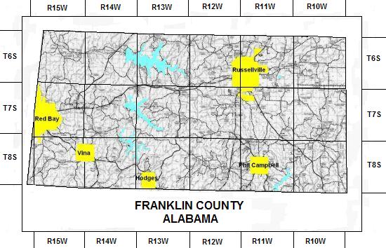
This map depicts the different townships and ranges by highlighting certain areas. The map is also divided into smaller sections by vertical and horizontal lines.

Cadastral Maps

http://gallery.archives.govt.nz/v/christchurch/Acland/CH117_+145+Cadastral+maps2.jpg.html

This Cadastral Map depicts the ownership of the Acland's family and their neighbors. This map is quite an old map of family boundaries.

Thematic Map

http://www.elderweb.com/node/2867

This map depicts the proportion of households with people 65 years or older in the state of Florida. The different colors determine a larger or smaller portion of 65 year olds.

Topographic Map

http://www.mapsofindia.com/maps/schoolchildrens/topographic.htm

In this topographic map you can see altitude and major geographic features of the country of India. The different colors depict different areas in the country.

Planimetric Map

http://egsc.usgs.gov/nimamaps/topo.html

This is a planimetric map of Iraq. In this color map you can see major cities, boundaries, railroads and refineries. This map conveys the major points of income and security within the country.

Mental Map


This map was drawn from memory from a student. The map is in pretty good detail considering it is from memory. This is an example of mental mapping because it is what the student saw the map like in his/her head.